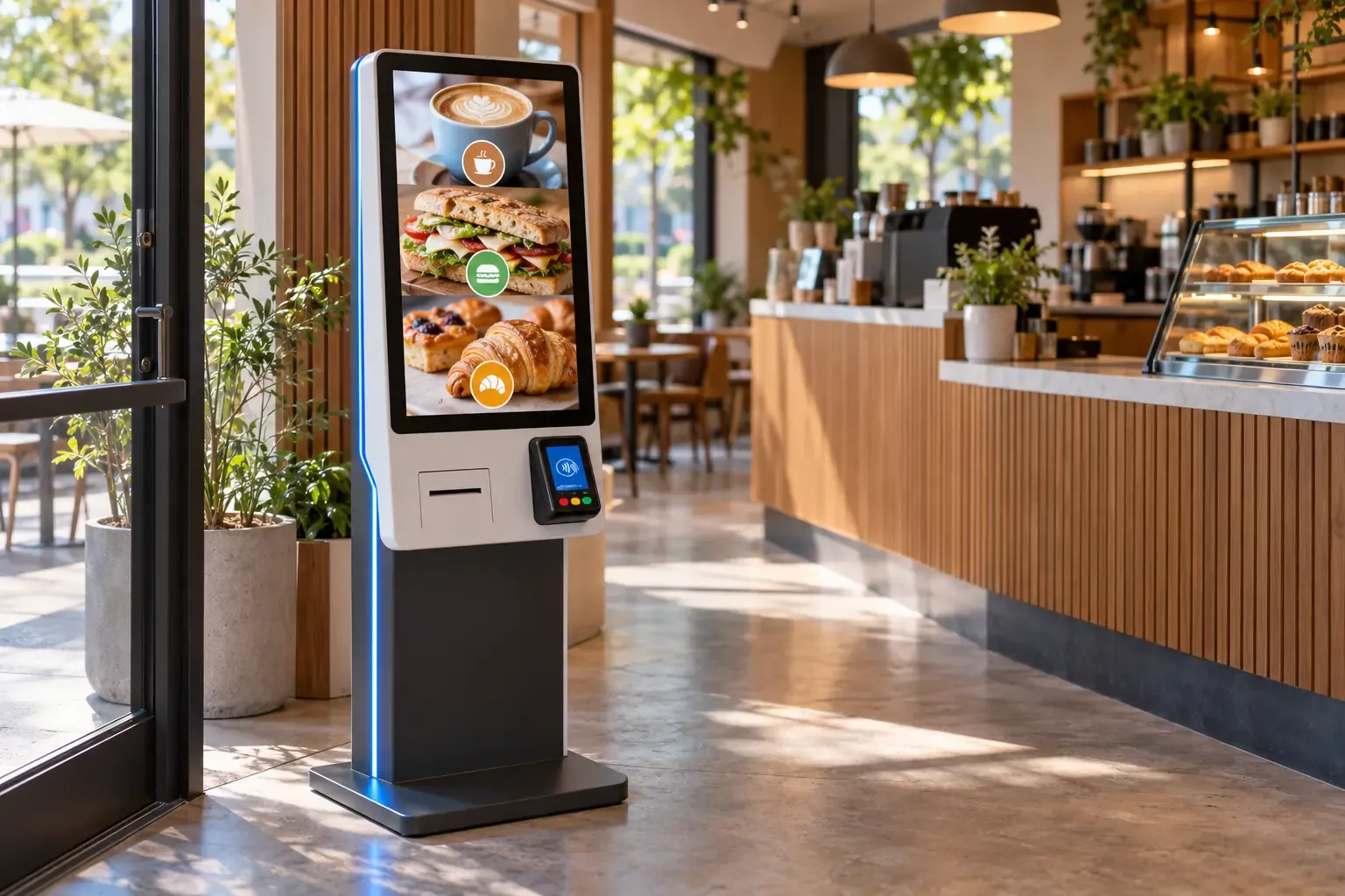
You can build a kiosk with smooth payments, a well-organized menu, and custom upselling—but customers still need to notice it.
If they walk straight past it and join the cashier line, the self-service experience never starts.
For an operator, this makes visibility part of the project from the beginning. The enclosure, screen, placement, and interface all need to communicate one simple message: you can order here.
Make It Recognizable as a Place to Order
A small tablet beside the register can be easy to mistake for a staff device, loyalty screen, or delivery pickup terminal.
Customers should not have to investigate what your kiosk does.
Give it a clear identity:
- A customer-facing screen that is easy to spot.
- A prominent “Order Here” message.
- A visible payment terminal.
- An opening screen that invites customers to begin.
- A stand or enclosure that distinguishes it from equipment behind the counter.
A larger touchscreen can help establish that presence. But size alone is not enough—a large screen displaying a promotional slideshow can still look like an advertisement.
The hardware and software need to tell the same story.
Put It Where Customers Decide How to Order
Think about what a customer sees when they enter.
Where do they look first? Where does the cashier line begin? At what point do they decide where to stand?
That is the area to evaluate for kiosk placement.
If customers only discover the kiosk after they have joined the line, using it requires them to change course. If it sits behind the queue, furniture, or a merchandise display, it may disappear from their view entirely.
Position it where approaching customers can see the screen and understand its purpose, with enough room to stop and use it comfortably.
Also consider the space around it. A kiosk that blocks the entrance or forces other customers to squeeze past creates another problem.
Use a Direct Opening Screen
The first screen should make the next action obvious.
“Tap to Start Your Order” gives customers a clear instruction. A logo alone does not.
Keep the opening screen focused:
- Use large, readable text.
- Make the start action prominent.
- Give text strong contrast against the background.
- Keep decorative content from competing with the instruction.
Your branding can still have personality. Food photography, brand colours, and subtle animation can support the experience—as long as customers immediately understand that the screen is interactive.
Make the Payment Step Clear
A visible payment terminal helps communicate that customers can complete their purchase at the kiosk.
The interface should then explain what happens next. If customers need to pay at the counter, say so before they begin. If they can pay directly at the kiosk, make that clear too.
Avoid leaving customers wondering whether they are browsing a menu, submitting an order, or completing a purchase.
That clarity should continue after payment. Tell them how their order will be identified and where they should wait or collect it.
Watch What New Customers Actually Do
A kiosk can look obvious to the person who built it and still confuse someone entering the business for the first time.
During an initial deployment, observe the customer journey:
- Do customers notice the kiosk before joining the line?
- Do they understand that they can use it?
- Do they find the start button without help?
- Do they know where to pay?
- Do they understand what happens after ordering?
If staff repeatedly need to point it out, treat that as useful feedback. The placement, signage, or opening screen may need an adjustment.
Design the Whole Ordering Point
A kiosk project includes the physical space around the software.
At Fieldzora, we bring together kiosk hardware, custom interfaces, payments, and integrations around the operator’s workflow. That includes thinking about how customers find the kiosk and begin using it.
Before adding more features, ask a simpler question:
Will a customer walking through the door know they can order here?